South Asian Brands We Love (And Why You Should Too)
We've been watching South Asian food brands break out of the "ethnic aisle" and land on mainstream shelves. And they're not doing it by playing it safe, they're doing it with bold branding, unapologetic packaging, and strategic positioning.
As a branding agency, we wanted to take a closer look at what's actually working from a design perspective. To admire and to analyze their design choices, visual identity systems, and packaging strategies, and pull out lessons that apply whether you're launching achaar or artisanal bread.
Here's our design analysis of some of our favorite South Asian food brands making moves in the market.
1. Brooklyn Delhi
Category: Indian condiments (achaar, chutneys, simmer sauces)
Founded by: Chitra Agrawal & Ben Garthus (Brooklyn, NY)
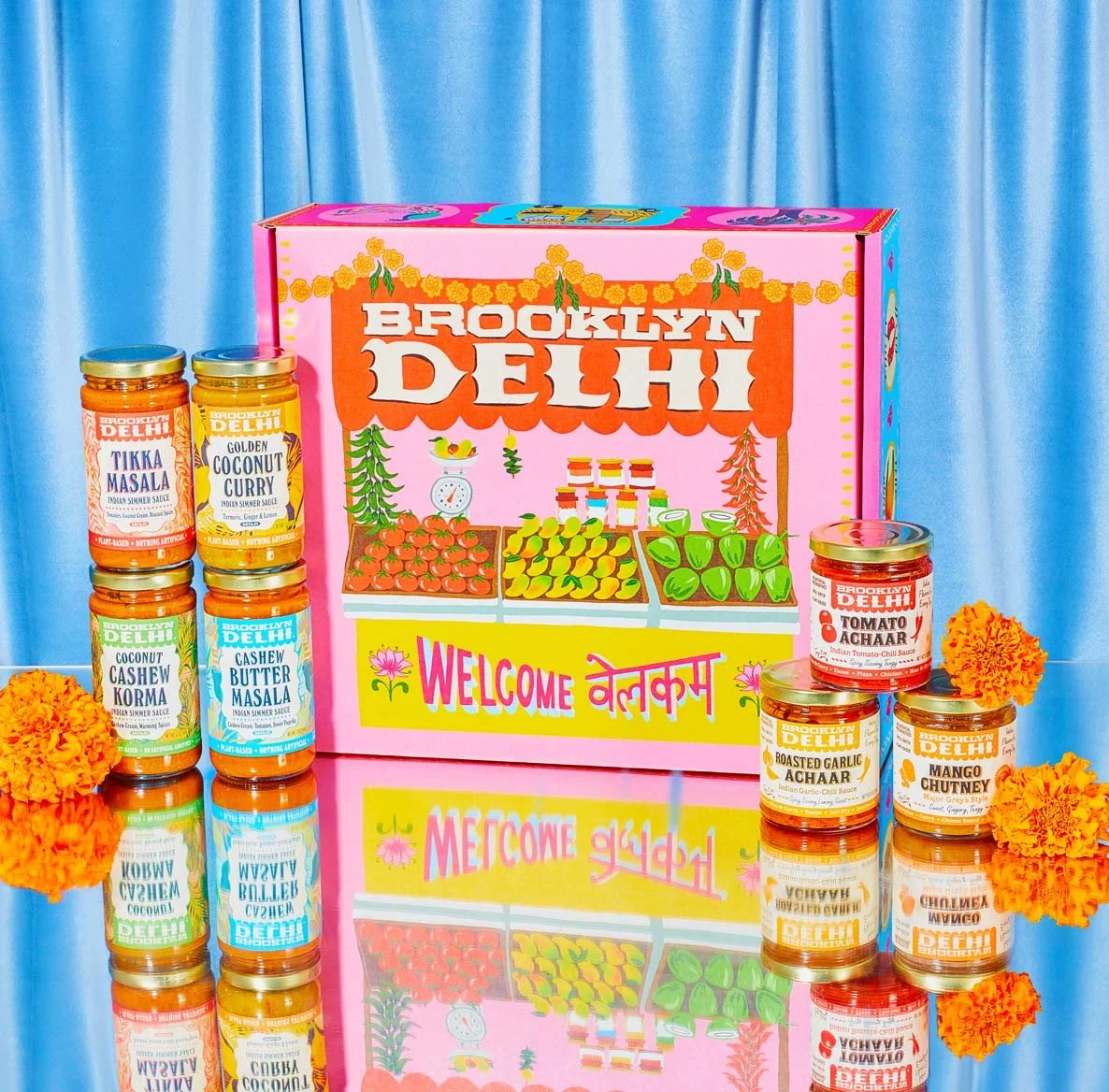
The Design Analysis
From our perspective, Brooklyn Delhi has built a very strong and expressive brand identity. The illustrations are beautifully done, playful, vibrant, and full of personality. They immediately communicate warmth, culture, and joy, which aligns perfectly with food branding.
The color palette works well. It feels bright and energetic while still being rooted in Indian cultural references.
The use of bold colors reflects the richness and vibrancy of Indian cuisine, yet it's adapted in a way that feels modern and accessible. The illustrations, typography, and colors come together seamlessly, and the storytelling feels intentional and engaging.
2. Peepal People
Category: Pakistani-inspired hot sauce
Founded: Alyzeh Rizvi & Ahmer Zaidi (Atlanta)
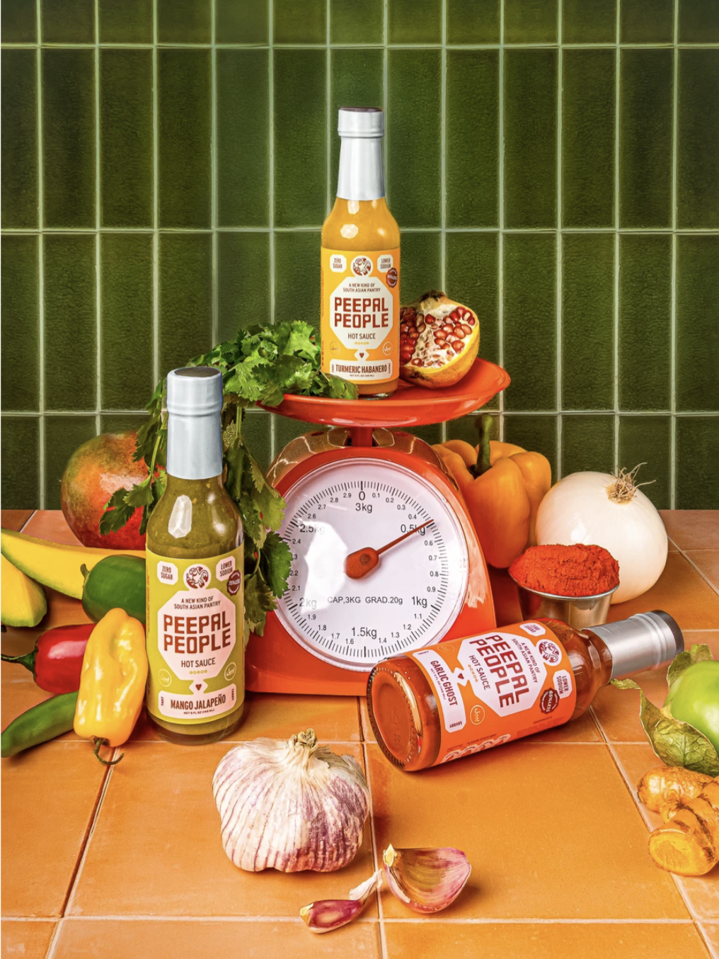
The Design Analysis
We love their illustrations, they feel unique, expressive, and thoughtfully designed. For example, their digital card illustrations and USP icons show a clear design direction.
They aren't generic; they feel intentional while still rooted in culture.
What we appreciate most is how they subtly yet powerfully incorporate South Asian culture into their brand storytelling. Their photoshoots often feature South Asian hands and traditional jewelry. It's not loud or overly literal, but it's a strong cultural cue. It communicates identity and heritage in a refined way. This indirect yet confident representation makes the brand feel authentic and grounded in its roots.
Their website presentation is clean and well-structured. The hierarchy is clear, making the browsing experience smooth and easy. It feels polished and thoughtfully laid out.
3. Brightland
Category: California olive oil
Founded: Aishwarya Iyer (Indian-American, Los Angeles)
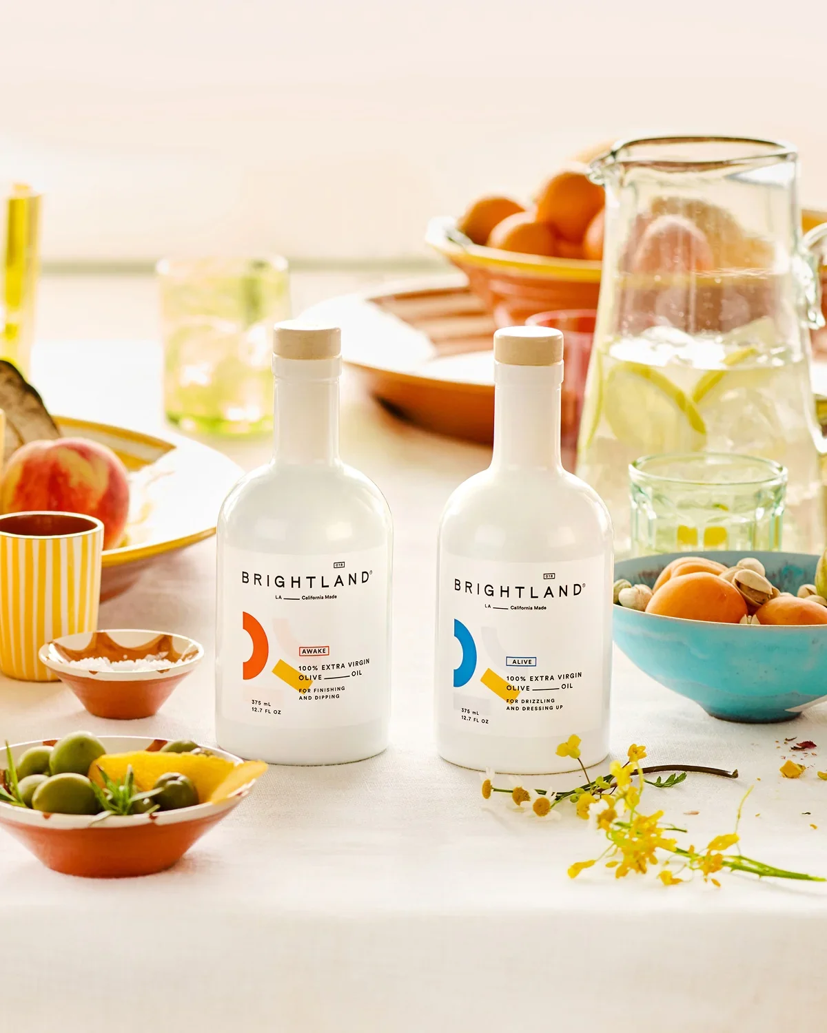
The Design Analysis
This brand feels like a beautifully art-directed, premium lifestyle brand rather than just a food company. We especially love their bottle choice, the matte-finish bottles immediately elevate the product and make it feel design-forward.
Their color palette is curated and refined. Even though they do have colors in their palette, those tones are especially expressed through their shoots in the fruits, vegetables, crops, and plated dishes, while the product itself remains clean, minimal, and highlighted. This contrast allows the bottle to stand out in a very premium way.
The packaging has a strong hierarchy and plenty of breathing space, which makes it feel confident and intentional rather than crowded. This minimal yet artistic approach is carried consistently across their website and Instagram, creating a seamless and cohesive brand world.
4. Drink Juni
Category: Sparkling adaptogen tea
Founded: Jay Shetty & Radhi Devlukia-Shetty (British-Indian & Indian-American)
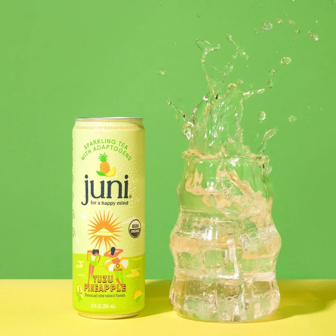
The Design Analysis
Juni feels like a youthful, wellness-driven beverage brand that's trying to redefine how people think about sparkling drinks. We really love the meaning behind the name "Juni", derived from "Just You and I." It feels intentional, warm, and meaningful, adding an emotional layer to the brand beyond just the product.
Their marketing and storytelling are strong, especially on Instagram. They collaborate with creators and give the brand a human touch by having the founders personally talk about and promote it, which builds trust and relatability.
Visually, the brand feels energetic and playful. The use of gradients is colorful and expressive, and the illustrations align well with the flavors, making the product feel fun and approachable.
5. Malai
Category: South Asian-inspired ice cream
Founded: 2015 by Pooja Bavishi (Brooklyn, NY)
The Design Analysis
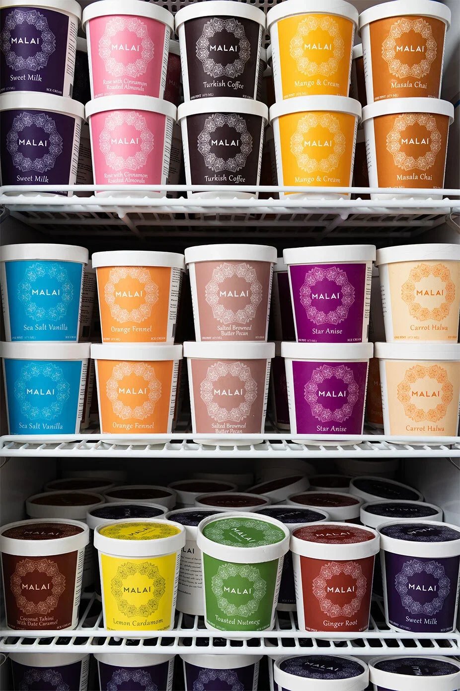
Malai's packaging is sophisticated without being kitschy. The design is clean, modern, and approachable, letting the flavors speak for themselves.
Each flavor has its own distinct color (rose is blush pink, masala chai is warm brown, orange fennel is bright orange), creating strong shelf presence and instant flavor recognition. This is smart, it's the same strategy Ben & Jerry's uses, applied to South Asian flavors.
The pint designs feature hand-drawn botanical illustrations that feel elegant, not cutesy. The rose petals on Rose with Cinnamon Roasted Almonds, the chai spices on Masala Chai, they're rendered with detail and sophistication.
Typography-wise, the Malai logo uses a modern sans-serif that's friendly but refined. Flavor names are set in a complementary serif that adds warmth. The hierarchy is clear: brand first, flavor second, description third.
END NOTE
These brands aren't just succeeding because they have great products (though they do). They're succeeding because they've made strategic design choices that position them clearly, communicate their value visually, and honor their cultural roots without apologizing for them.
As a branding agency, we're analyzing these brands not to copy them, but to learn from them. Because the principles they're applying, specificity, hierarchy, intentional design, cultural authenticity, work whether you're selling Pakistani meal kits or Midwestern hot sauce. If you want to dive deeper into the breakdowns of packaging & what components make it truly an effective one then, you must definitely read this blog here.
Good branding isn't about looking expensive. It's about looking intentional. And these South Asian founders are proving that when you combine cultural pride with smart design, you don't just build a product, you build a category.
Want to build a brand rooted in your story?
At Gulabi Mango, we help food entrepreneurs create brands that honor where they come from while building something that feels entirely their own.