The Anatomy of Retail-Ready CPG Packaging
Here's something we've learned from years of designing CPG packaging: there's a specific moment, somewhere between scrolling through Instagram and standing in an aisle when a product either speaks to you or becomes background noise.
When we worked with Its Actually, Elaichi Co., and several other brands we learned something crucial: in the world of Consumer Packaged Goods (CPG), your packaging isn't just a container. It acts as your silent salesperson in the retail space, your brand ambassador. Whether you're launching a new product or refreshing an existing line, understanding the non-negotiables of CPG packaging can mean the difference between shelf success and obscurity.
And it's precisely why we've developed a pretty specific approach to CPG packaging at Gulabi Mango after working on several successful projects that actually works on shelf and screen.
Our Packaging Philosophy: Retail-Ready From Day One
We design packaging with one non-negotiable principle: it needs to work everywhere. Not just in perfectly lit product photography. Not just on your Instagram grid. But in the harsh fluorescent lights of a grocery store aisle, in the three-second scroll on a phone, and in someone's hands as they flip it over to read the back.
Every brand we work with follows a similar or a very close foundational structure, because it works.
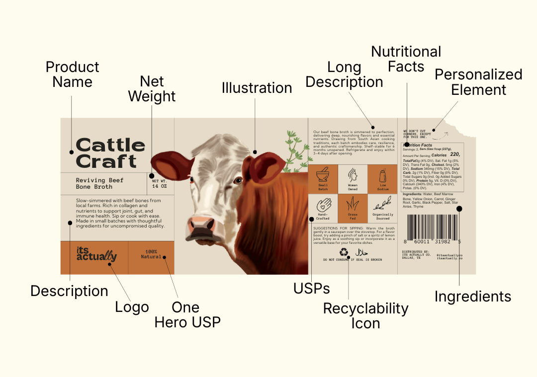
The Front Of The Packaging
The front of any package we design follows a hierarchy that we've tested, refined, and stood behind time and time again:
Product Name: Clear to what the brand’s trying to sell, but can be a little unique to the brand
Description: Just enough to make a consumer curious & clear of what’s inside
Logo: Your brand mark, positioned with intention
Net Weight: Because transparency is the first & foremost element of any packaging
One Hero USP: Front and center, the reason a consumer should care or that speaks the most from the product’s perspective
An Illustration: something that resonates with the brand’s design tone & stands out in the aisle, attracting customers visually
The Sides: Where The Product Speaks
Here's where most brands fumble. They treat the sides and back of packaging like an afterthought, a place to dump regulatory information and call it a day.
But that’s not how we do packaging at Gulabi Mango. The other panels are where we build the relationship with the consumers. This is where we include:
Brand Story: If you have one (and you should), we tell it here. Not the sanitized "About Us" from your website. The real story. The why-this-product-exists story.
Personalized Elements: Batch numbers, founder's notes, QR codes linking to recipes, seasonal messages. Things that make your customer feel like they're in on something.
Ingredients: Listed clearly, because modern consumers read these. We don't hide them in microscopic type at the bottom.
Nutritional Facts: Formatted for easy scanning, and following FDA guidelines.
More About the Product: Usage suggestions, origin stories, what makes this different.
Additional USPs: Icons, illustrations, diagrams that represent USPs of the product. Because people don't prefer reading paragraphs on packaging, they scan.
Recyclability Information: Not just the symbol. Clear instructions on how to actually recycle or dispose of the packaging.
The Non-Negotiables
1. Retail-Ready From a Design POV
Your packaging should work in every retail environment. This means considering everything from how the package looks when stacked to how readable the text is from feets away.
2. Hierarchy That Guides the Eye
Typography isn't just about looking pretty. It's about creating a visual flow that pulls people through your story. The size, weight, spacing, and color because these details determine whether someone reads your packaging or moves on to the next product.
3. Illustrations That Do Work
The illustration on your package isn't decoration. It's doing the same job as your USP, just in a different language. It needs to convey mood, quality, and differentiation at a glance. When we create illustrations for CPG brands, we're thinking about shelf impact, brand codes, and visual storytelling simultaneously.
4. Information Architecture That Respects Intelligence
We don't dumb things down, but we also don't make people dig for basic information. Ingredients, nutritional facts, usage instructions, all of it should be easy to find and easier to understand.