The Past Is Back. And Honestly, Design Has Never Looked Better.
Let's be honest: design got boring. For the better part of a decade, everything looked the same. Clean sans-serifs. Muted palettes. Flat icons. Generous white space. Polished. Frictionless. Completely forgettable.
And then, slowly at first and now all at once, something shifted. The most exciting work coming out of studios right now is pulling hard from the past, Y2K chrome, scrawly handwritten type, lo-fi camera roll photography, and much more.
Nostalgia has officially become a design strategy.
Here's what's driving it. AI happened, and it produced an avalanche of over-polished, perfectly smooth, soulless visuals. Suddenly, imperfection became valuable. Grain, texture, wobbly lines, things that once read as "mistakes" are now proof that a real person made something with intention.
At the same time, Gen Z (the most influential design consumer on the planet right now) has genuine nostalgia for early internet aesthetics.The result is a design landscape swinging hard from minimalism toward maximalism. Here's what we're watching, and what it means for brands.
The Trends
1. Y2K & Frutiger Aero
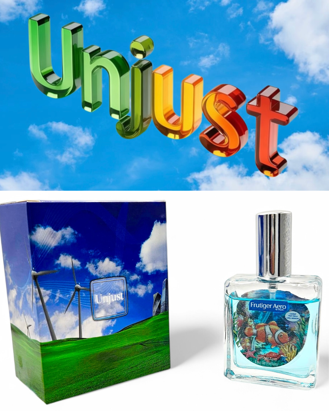
Chrome text. Bubble fonts. Aqua gradients. Holographic everything. Y2K aesthetics rooted in the techno-optimism of 1997–2005, are back with force.
The specific sub-trend to know:
Frutiger Aero. Think Windows XP default wallpaper energy, glossy, shiny, lens-flared, carrying the optimism of a world convinced the future would be sleek.
The smart use: Don't go full MySpace. Pick one or two signals, a metallic gradient, a bubble wordmark and let them sit inside an otherwise clean system.
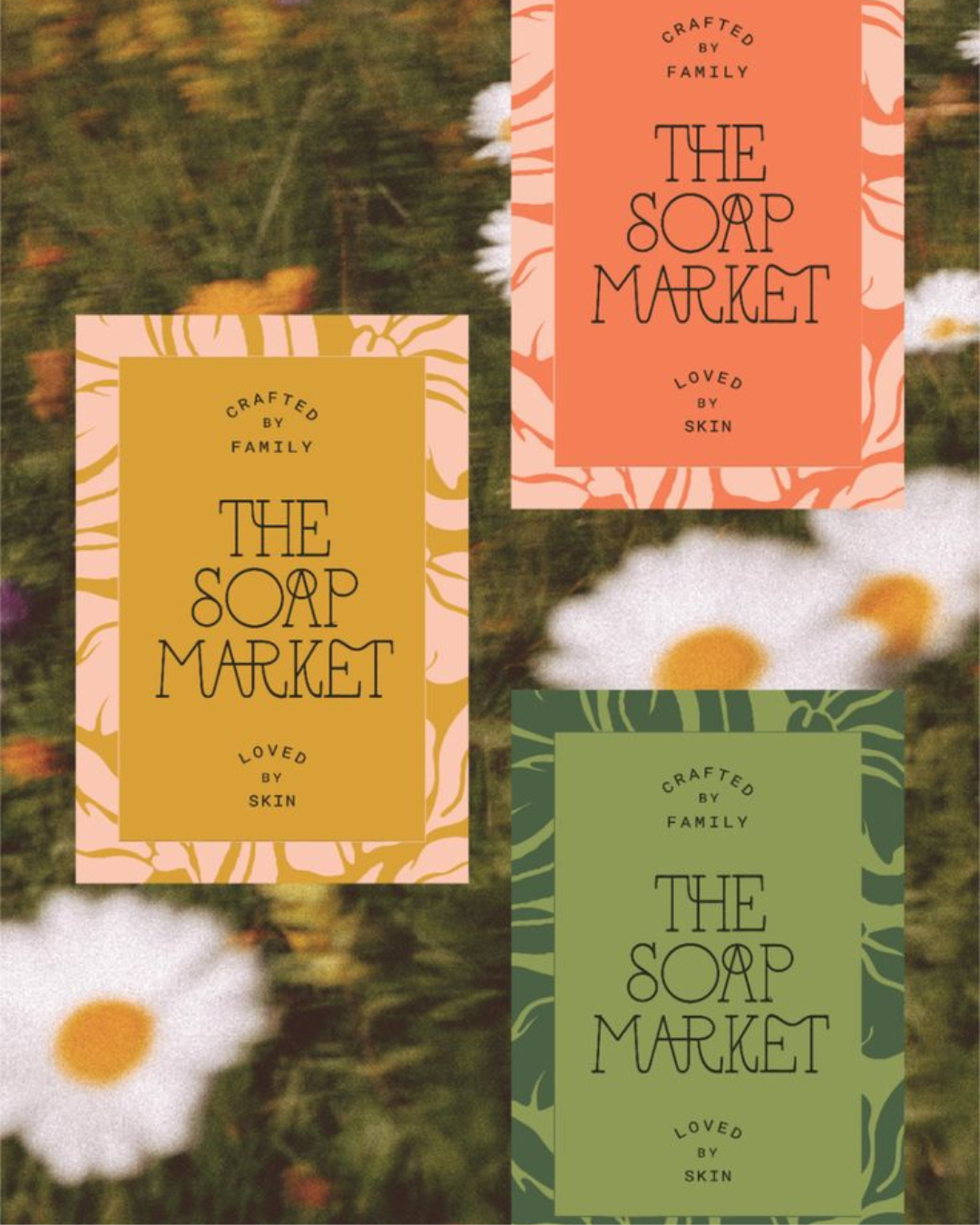
2. Handwritten Fonts
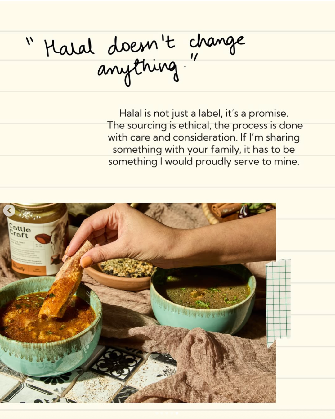
When everything can be generated perfectly, imperfection becomes a trust signal. Hand-drawn and handwritten fonts with their uneven baselines and irregular rhythm say something a clean sans-serif never can: a person made this.
The trend is moving toward softer, more personal scripts: dainty strokes, a sense of informal quirk, like notes from a friend. It's especially dominant in food, skincare, and lifestyle, anywhere warmth matters to the purchase decision.
You can have a look here how we incorporated this trend long back for one of our CPG project into their packaging and socials.
The smart use: Use handwritten type as an accent, not the whole system. A hand-drawn logo + clean body font.
3. Candid Camera Roll
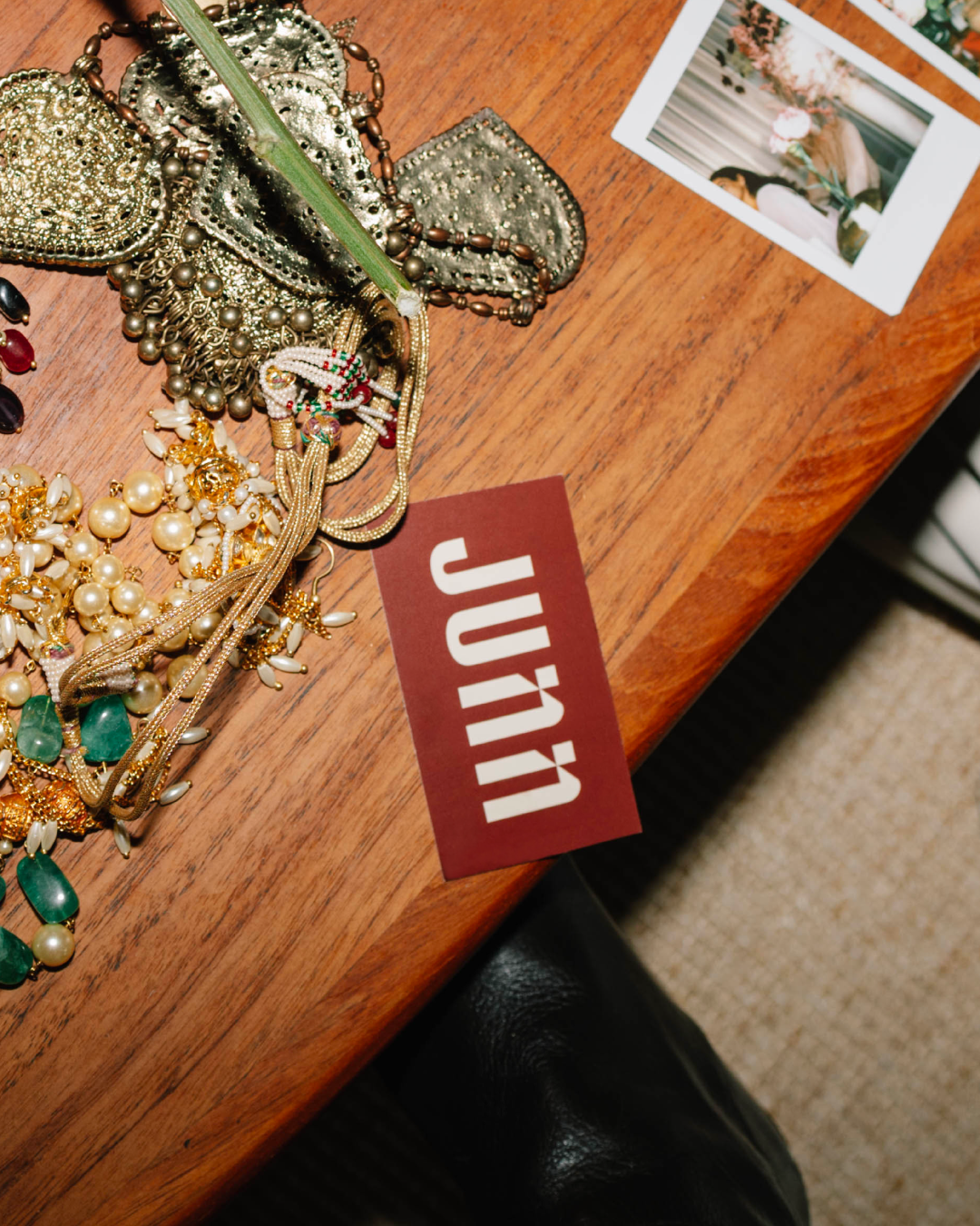
Raw, personal, unstaged like scrolling through someone's actual photo album. Flash photography, hazy film textures, light leaks, accidental framing. The anti-photoshoot aesthetic.
The 2026 update: brands are now layering these candid images with minimal typography or scrawled, hand-drawn notes creating content that feels less like an ad and more like a memory.
The smart use: Resist the urge to clean it up. The grain, the blur, the imperfect crop that's the point. Pair with restrained type so the image carries the emotion.
4. Scanned & Analog
Designers are reaching for scanners, not just software. Printing things out, crumpling them, scanning back in, and using the resulting texture, the grain, the scanner marks, the uneven ink, as the actual design asset. Mixed media: photos, doodles, stamps, brush textures layered into collage-style compositions.
As AI-generated imagery gets cleaner, tactile and analog signals become harder to fake, and more valuable because of it.
The smart use: Texture works as atmosphere, not decoration. Apply it as a background layer to digital-native layouts. Clean type on rough texture = the contrast that makes it intentional.
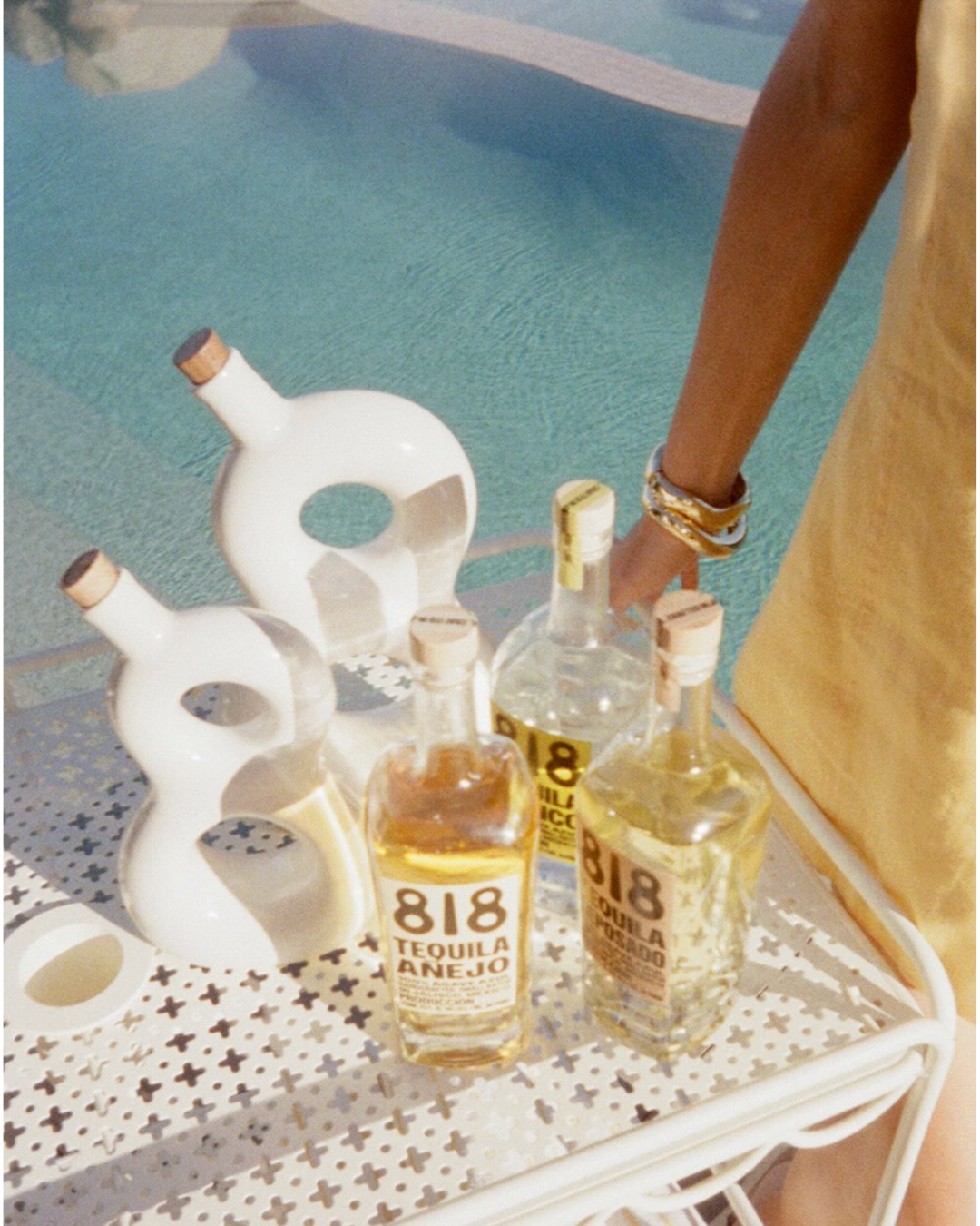
5.Nostalgic Maximalism
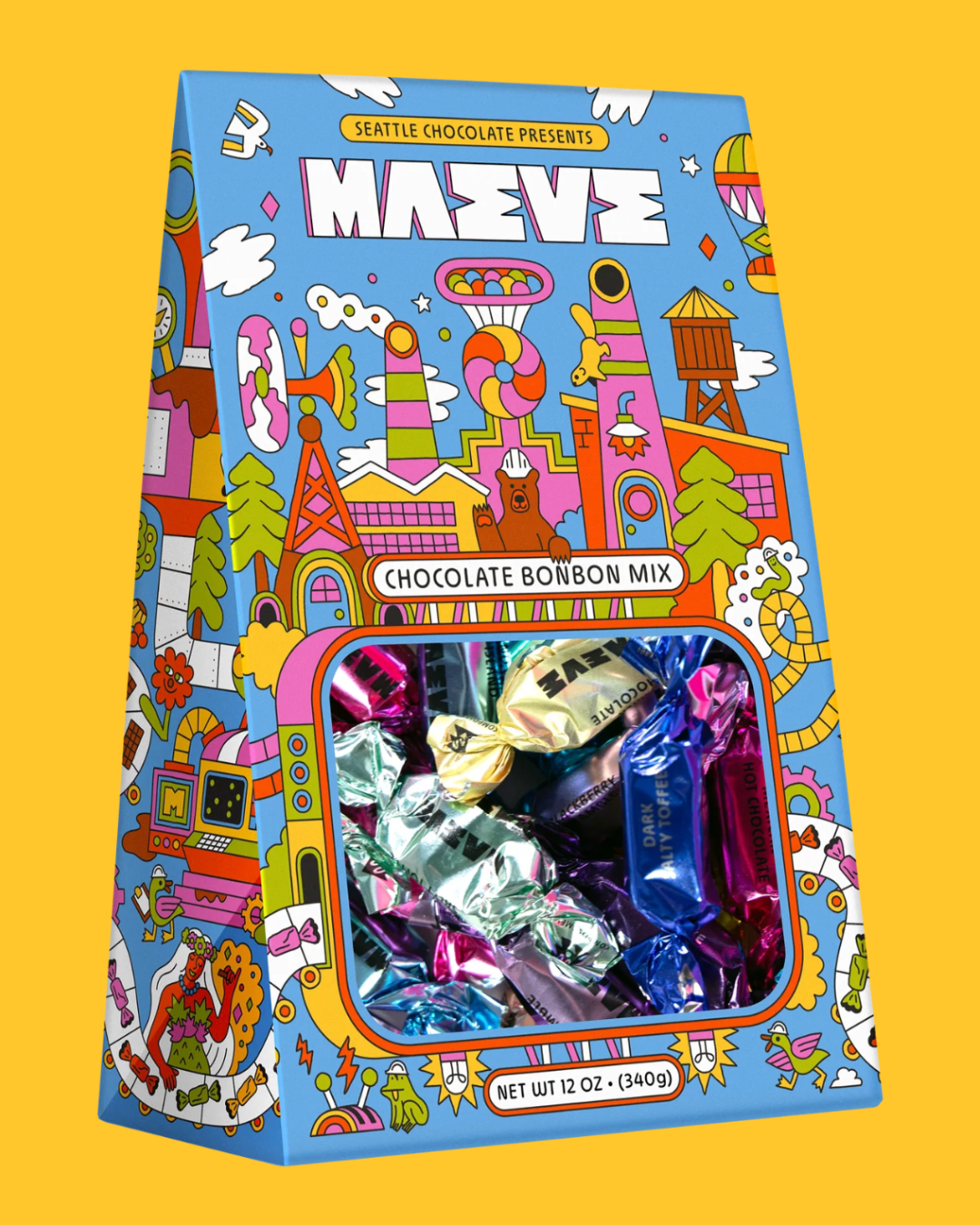
The more-is-more philosophy that dominated 2025 is not slowing down. Controlled chaos. Heavy layering. Bold colour clashes. Overlapping backgrounds. College-style compositions that look feral at first glance but run on a very intentional pulse.
Adobe's trend data confirms this: bright, saturated palettes; realistic textures mixed with surreal elements; a pendulum swinging between nostalgic and futuristic aesthetics simultaneously.
Search interest in 80s and Y2K-themed design is up over 80% in recent months. People are done with whisper-quiet branding. They want to feel something.
The smart use: Commit fully or don't go there. Half-hearted maximalism looks cluttered. Know your cultural reference point, vague nostalgia lands flat, specific nostalgia resonates.
6. High-Contrast Serifs
After years of stripped-back sans-serifs across every industry, high-contrast serifs are staging a serious return. Thin strokes. Thick strokes. The kind of type you'd see on an old apothecary label or a legacy newspaper front page.
A sense of craft and permanence that geometric sans-serifs simply don't carry.
These fonts signal that a brand has been somewhere even if it hasn't.
They pair especially well with the texture trend: a high-contrast serif on a grain-textured background is one of the strongest visual combinations in branding right now.
The smart use: Use as display type, headlines, packaging, wordmarks. Too visually demanding at body copy size. Let it set tone at the top; let a cleaner font carry the rest.
So What Does This Mean for Your Brand?
Not every nostalgic trend is right for every brand. Slapping Y2K chrome on a fintech product because it's trending is how you end up looking like you don't know who you are.
But taken together, these trends are pointing at something bigger than aesthetics. They're pointing at what people want from brands right now: proof of humanity, emotional resonance over visual neutrality, and specificity over safe vagueness.
The era of weightless, over-polished branding is fading. In its place: texture, mood, and brands that feel like they belong to real places and real people.
If you feel your brand needs a touch of new, fresh design perspective, let’s connect and discuss!