Inside Our Branding Workshop: How We Approach Every Branding Project
By Ekta, Lead Designer at Gulabi Mango
Last week, we did something very different and interesting at Gulabi Mango. We started these internal workshops as a way to share knowledge across the team. Each of us takes turns leading a session on something we're deeply immersed in, in our own area of expertise, the things we've learned through trial and error that don't make it into client presentations.
I kicked off the series with branding. And honestly? Walking the team through my process from start to finish made me realize how much of it has become instinct, decisions I make almost automatically now that used to take me hours to figure out. So here's what I shared, laid out step by step, in the hopes that it might be useful to you too.
Where Every Brand Project Begins: The Client Questionnaire
Before I touch Illustrator or open a mood board, I start with words. Lots of them.
When a client comes to us for branding, we send them a comprehensive questionnaire. It's not a quick five-question form, it's deep. We ask about their origin story, their pricing model, craftsmanship, short or long-term vision, their mission, their values, their target audience, their competitors, their aspirations & much more. We ask what feeling they want their brand to evoke. We ask them to describe their brand as if it were a person. We ask about their non-negotiables and their furthest vision.
Most clients spend hours on this. And that's intentional. Because the answers they give us? That's the raw material I work with for everything that comes next.
Competitive Analysis: Know the Landscape Before You Start Into Designing
Before I start sketching logos or building mood boards, I need to understand the visual territory our client’s brand is entering. That means competitive analysis and I do it thoroughly.
I pull together 8-10 direct competitors and 3-5 aspirational or adjacent brands. Then I analyze:
Logo styles: Are they all using wordmarks? Symbols? Combination marks? Is there a dominant trend?
Color palettes: What colors are saturated in this space? What's conspicuously absent?
Typography: Is everyone using sans serifs? Are there any serif holdouts? What does that communicate?
Visual language: Modern and minimal? Ornate and detailed? Playful? Serious?
Tone of Voice: How are they positioning themselves through their visual identity?
Buyer Persona & Customer Journey: Who's buying from them and what path are they taking from discovery to purchase?
I'm not doing this to copy anyone. I'm doing it to understand where the white space is. Where can this brand sit that feels differentiated but still credible?
Next Step: Mining for Keywords
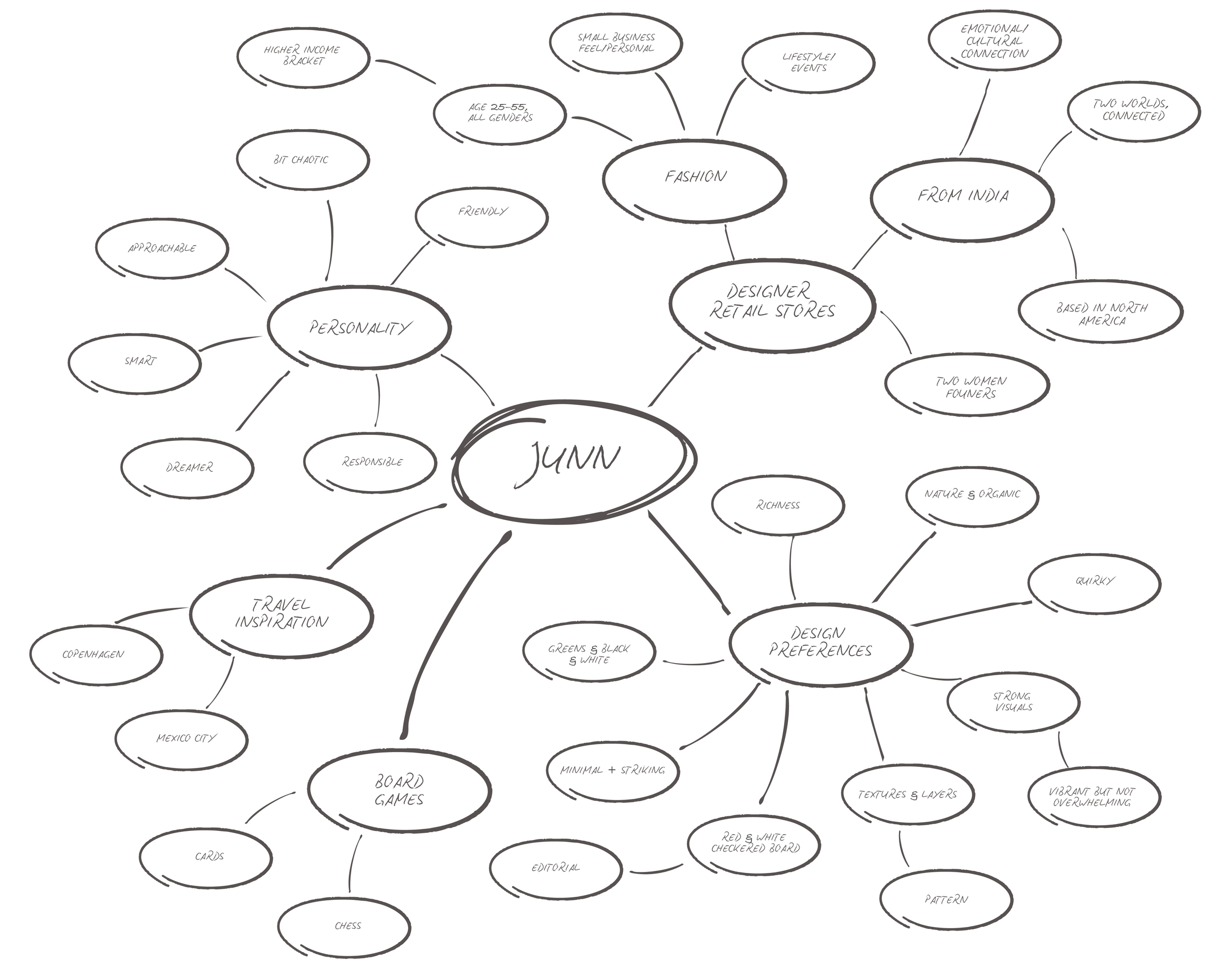
Once I have the completed questionnaire, & my research on our client’s direct & aspirational competitors, I go through all the documents slowly, carefully, and I start highlighting.
At this stage, I'm looking for keywords, recurring themes, emotional descriptors, anything that gives me a window into what this brand is trying to be.
For example, if a client mentions "heritage" three times, "craftsmanship" twice, and describes wanting their brand to feel "timeless but not outdated," those aren't throwaway words. Those are clues. Those are the building blocks.
I collect all these keywords, sometimes it's 15, sometimes it's 40 and I write them down in a separate document. This becomes my brand vocabulary. Every decision I make from this point forward has to ladder back to these words.
Moodboard: Visualizing The Brand Before Designing
After I've extracted all the keywords from the client questionnaire and before I even think about colors, logos, or fonts, I create mood boards. This is where I start translating words into a visual language.
Mood boards are my way of asking: "What does this brand look like? What does it feel like to exist in this brand's world?" Mood boards help me establish the aesthetic direction, the vibe, the energy of the brand before I get into the specifics of execution.
Think of it this way: if the brand were a room you walked into, what would you see? What would you feel? That's what I'm trying to capture.
What Goes Into My Mood Boards
I usually create 2-3 distinct mood board directions, each exploring a different visual interpretation of the brand based on those keywords. Each board includes:
Photography & Imagery: I look for images that capture the brand's essence, not literal representations of what they do, but the feeling we're trying to evoke.
Textures & Patterns: Texture adds depth and personality. I include texture references that support the emotional direction, whether that's woven fabrics, concrete surfaces, or geometric patterns.
Color Inspiration (Not the Palette Yet): At this stage, I'm not selecting final brand colors, I'm exploring color moods.
Typography Inspiration: I'll include examples of typography in the wild, not the fonts we'll use, but the kind of typography that feels aligned.
Objects & Environments: Sometimes I include photos of objects, spaces, or environments that embody the brand's personality.
Choosing a Color Palette: It's Not About What Looks Pretty
Here's where most people think branding gets subjective. "Oh, you just pick colors you like, right?"
Wrong.
Color is one of the most strategic decisions in branding. It's psychology, it's positioning, it's differentiation. And I have a very specific process for landing on the right palette.
Step 1: Translate Keywords into Color Associations
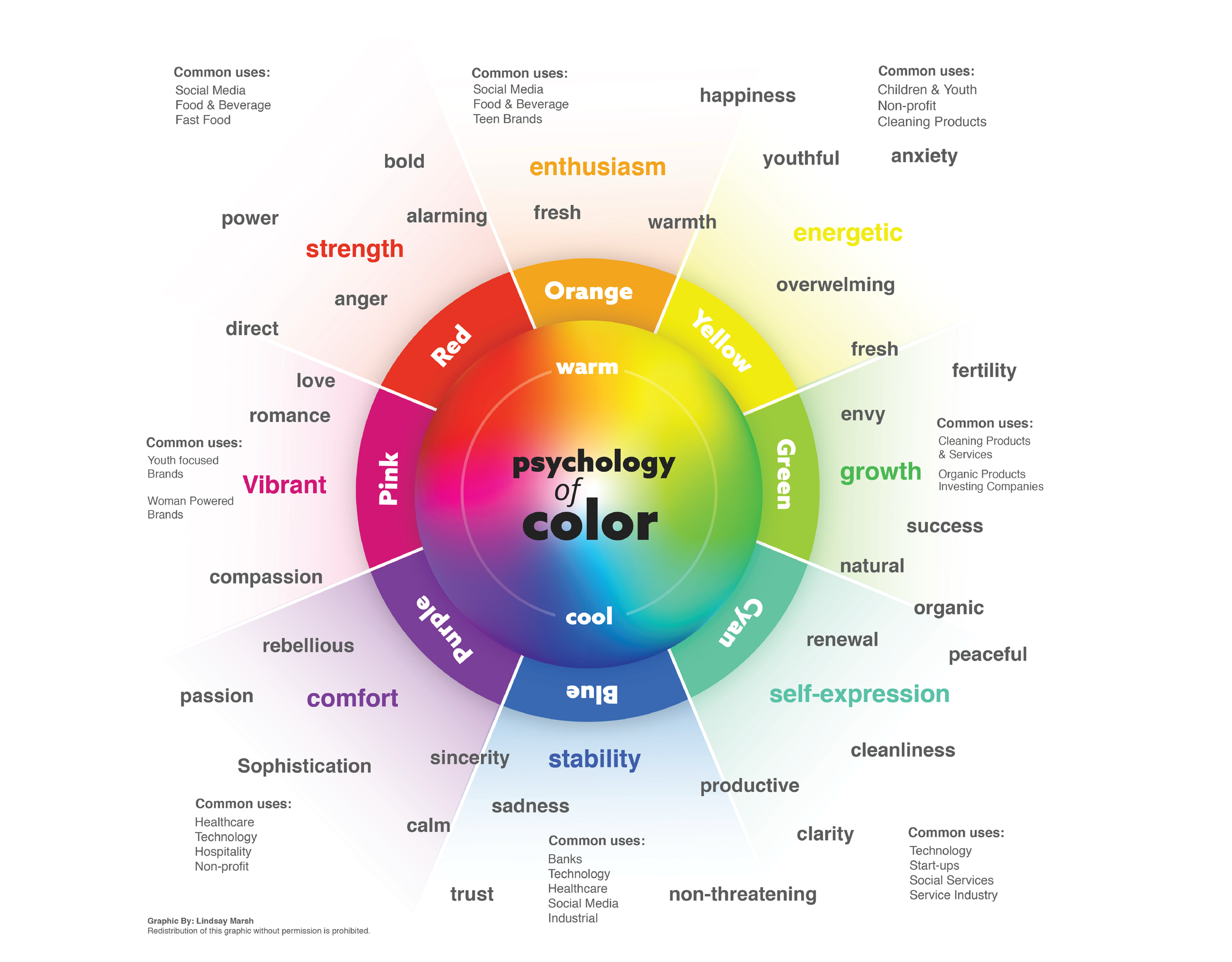
I take those keywords I extracted from the questionnaire and I start translating them into colors, not final brand colors yet, just associations.
If the brand is about "energy" and "innovation," I'm thinking bright, saturated tones. If it's about "trust" and "stability," I'm leaning into blues and grays. If it is "warmth" and "approachability," I'm exploring terracotta, soft yellows, peachy tones.
This isn't guesswork. There's decades of color psychology research behind these associations, and I keep those principles top of mind.
Step 2: Use Different Tools to Explore Combinations
Once I have a sense of the emotional territory, I head to tools like Adobe Color, Coolors, etc. These tools are underrated. You can input a keyword, let's say "heritage" and it will generate color palettes based on that concept. You can also input hex codes and see complementary, analogous, or triadic color schemes.
I'll often run multiple keywords through Adobe Color and start pulling swatches that feel aligned. I'm not committing to anything yet, I'm just exploring, seeing what resonates, what feels like it could belong to this brand.
Step 3: Go Back To The Brand Story
This is where the client's history and vision come into play. If they're a startup trying to disrupt a traditional industry, their color palette should reflect that tension, maybe something unexpected, a bit rebellious. If they're a heritage brand repositioning for modern audiences, maybe we keep one classic color but pair it with something contemporary.
I also look at their industry and competitive landscape at this stage (more on that in a minute). If every competitor is using navy blue, that tells me something. Either we lean into it and find a way to own it better, or we deliberately go a different direction to stand out.
Step 4: Build a Palette with Purpose
By this point, I usually have a shortlist of colors that feel right. Then I start building the actual palette: primary, secondary, and accent colors. I'm thinking about hierarchy: which color will dominate, which will support, which will punctuate.
I test them together. I look at them in different contexts, on screen, printed, as backgrounds, as text. I check accessibility and contrast ratios. And I keep asking myself: does this palette tell the story the client wants to tell?
Only when I can confidently answer yes do I move forward.
Crafting the Logo: Process Over Perfection
Okay, now we get to the part everyone thinks of when they hear "branding": the logo.
But here's the thing, I never start by trying to design the perfect logo. I start by trying to understand what this logo needs to do.
Step 1: Define the Job of the Logo
Every logo has a job. Some need to communicate heritage. Some need to signal innovation. Some need to be incredibly versatile (think: used on everything from business cards to billboards). Some need to work well at tiny sizes for app icons.
I refer back to those keywords, the brand's positioning, the competitive landscape. What does this logo need to communicate? What problem is it solving?
Step 2: Explore Multiple Directions
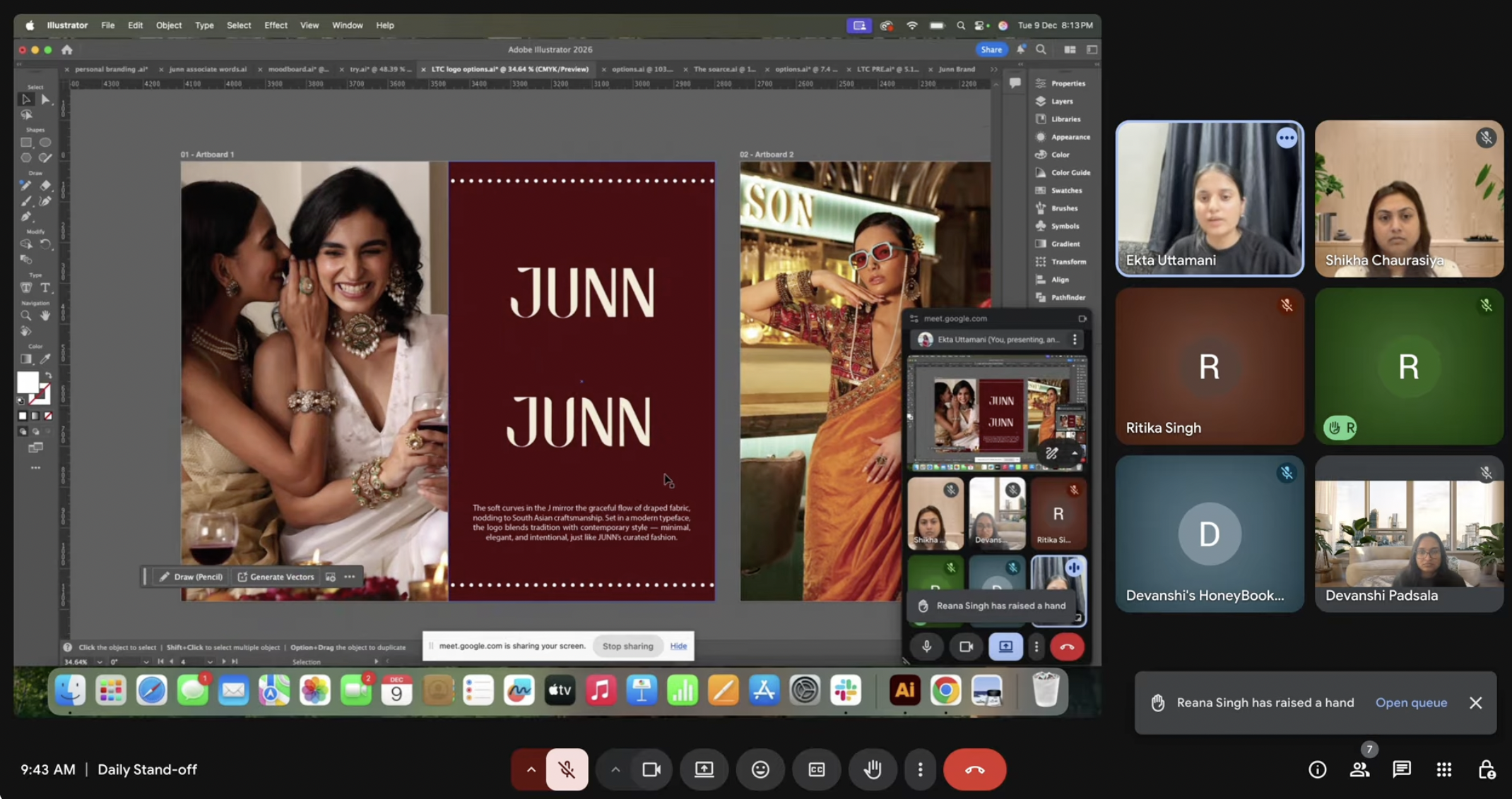
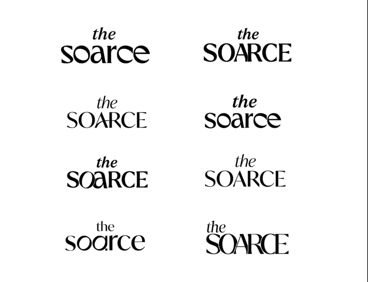
I never present one logo option. I explore multiple directions, usually three distinct routes that each solve the brief differently.
Option 1 might be a bold, confident wordmark that leans into typography.
Option 2 might be a clean, iconic symbol that can stand alone.
Option 3 might be a combination mark that balances both.
I sketch. A lot. By hand first, then digitally. I explore different levels of abstraction, different visual metaphors, and different ways to represent the core idea of the brand.
Step 3: Refining
Once I have a few directions I believe in, I start refining. This is where craft really matters, kerning, optical balance, how the logo sits on different backgrounds, how it scales.
I test each logo option in context: on a business card, on a website header, on packaging, as a social media profile picture. Does it hold up? Does it feel cohesive with the color palette and overall visual direction? Think a lot of mock-up designs!
Step 4: Present with Strategy, Not Just Aesthetics
When I present logo options to a client, I'm not just showing them pretty designs. I'm walking them through the strategic rationale: why this direction, why this choice, how it connects to their brand story and goals.
I explain what each option communicates, where it positions them in the market, and what it enables them to do. Because a logo isn't just a mark, it's a tool. And the client needs to understand how to use it.
Typography: The Unsung Hero of Branding
After the logo, typography might be the most important branding decision we make. And it's often the most overlooked. I consider the same factors I did for color: the brand's keywords, their story, the competitive landscape. If the brand is about precision and innovation, I'm looking at geometric sans serifs. If it's about warmth and humanity, maybe a humanist sans or even a friendly serif.
I usually select two to three typefaces for a brand system:
Primary typeface (often used in the logo or headlines): This is the personality-driven choice. It needs to have character and reinforce the brand's positioning.
Secondary typeface (body copy, supporting text): This needs to be highly legible and versatile. It's the workhorse.
Optional accent typeface (for special moments, quotes, callouts): This adds a layer of visual interest but shouldn't dominate.
The Through-Line: Keywords to Execution
What I hope you're noticing is that there's a through-line in my process. Every decision connects back to those initial keywords I pulled from the client questionnaire.
The colors aren't arbitrary, they're rooted in the brand's story and strategy. The logo isn't just a cool design, it's a deliberate answer to the question "what does this brand need to communicate?" The typography isn't random, it reinforces the personality we're building.
This is what makes branding strategic, not just decorative. It's not about making things look good (though they should). It's about making things mean something.


