What makes packaging easy to find (and easy to pick)
Good packaging gets noticed. Clear packaging gets picked.
Shoppers make the call fast. They're scanning a shelf, scrolling a product page, or flicking past a post in their feed, and your packaging has a few seconds to tell them who you are and what's inside. The tricky part is that it has to do that in all three places, and look like the same product every time.
We worked through this with Its Actually, a small-batch halal bone broth brand, and it shaped almost every decision we made. Here's what we learned, and the 6 things we now check on every packaging project.
Three broths, three personalities
Its Actually started with a simple need: real nourishment during a time of healing. The founder was frustrated by store-bought broths full of additives, so she turned to her South Asian roots and started making her own. By the time she came to us, she had three broths, a loyal following, and plain jars that all looked the same.
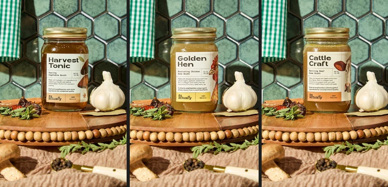
The brief was to make each broth easy to tell apart without losing the feeling that they belong to one family. So every jar got its own name and its own label color:
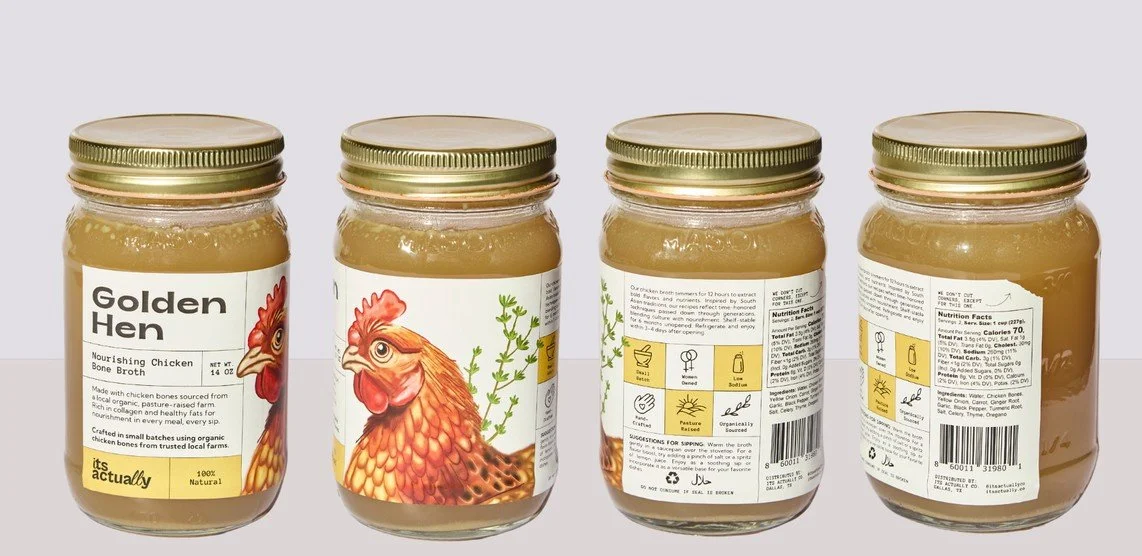
Golden Hen for the chicken bone broth, in warm yellow
Cattle Craft for the beef bone broth, in terracotta
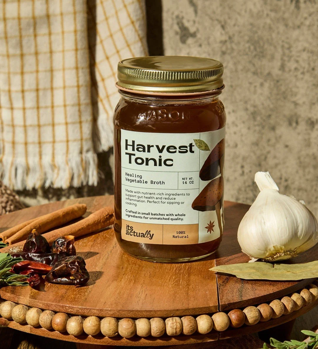
Harvest Tonic for the vegetable broth, in soft sage
Under each name, in plain type, sits exactly what's in the jar: "Nourishing Chicken Bone Broth," "Reviving Beef Bone Broth," "Healing Vegetable Broth." The "its actually" logo sits in the same spot on every label. You can tell them apart from across the kitchen, and you always know who made them.
The 6 checks
1. A brand name you can actually read
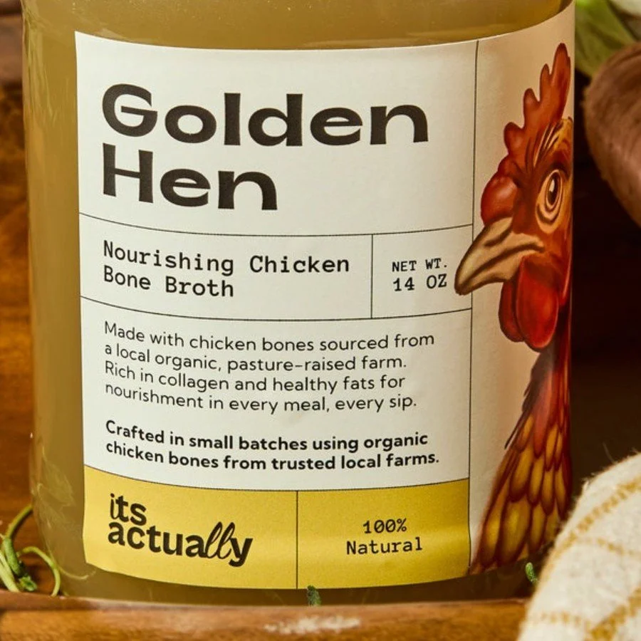
Thin scripts and low-contrast foil look beautiful up close, but they disappear from a few feet away and in a phone photo. Your name should be readable from across the aisle. On Its Actually, the logo is set in a bold, simple type on a solid color band, so it holds up on a shelf and in a tiny thumbnail.
2. What the product is, in plain words
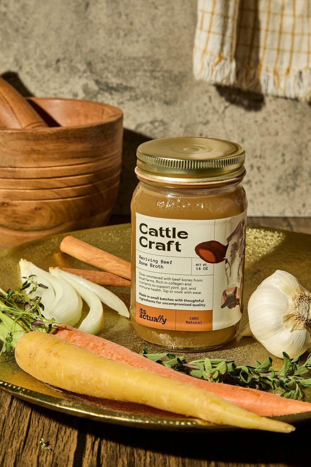
A creative product name is great for personality. It's not what people type into a search bar. "Cattle Craft" makes you smile. "Reviving Beef Bone Broth" right underneath tells you what you're buying. Give people both, and put the plain one on the front.
3. The same packaging in person and online
When someone sees your jar at a friend's house and looks it up later, the product they find online should look like the one they saw. If your website still shows last year's label, you're harder to find and harder to trust. Every time the packaging changes, the product photos change too.
4. Which flavor it is, at a glance
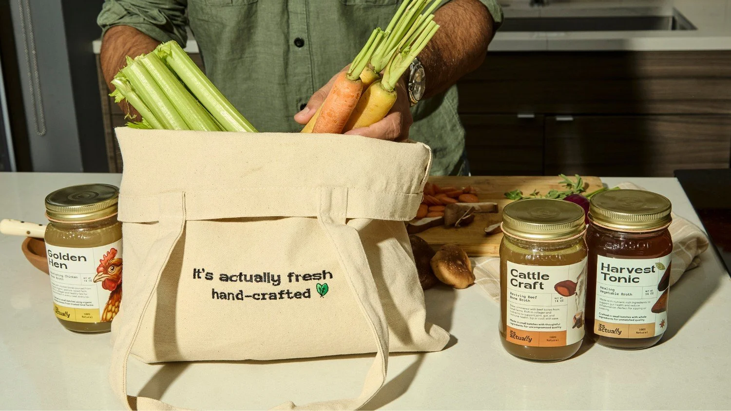
If you sell more than one version, people should be able to tell them apart without reading the back. Its Actually uses a different name and label color for each broth, with the broth type in the same spot every time. One look and you know which jar you're holding.
5. One clean shot of every product on your site
The first photo on each product page does a lot of work. Make it front facing, label in focus, and well lit. On itsactually.co, every product page opens with the jar facing forward and the full product name right next to it. That's the photo you want showing up when someone searches for you.
6. The same name everywhere
Your packaging, your website, your social handles and anywhere else you sell should all use the same name, spelled the same way. If you're "Its Actually" in one place and "It's Actually Broth Co" in another, you split your own search results. Pick one and use it everywhere.
Before your next print run
Save this and run through it before anything goes to the printer:
Can someone read your brand name from a few feet away?
Does the front say what the product is, in plain words?
Do the photos on your website match the packaging people will hold?
Can people tell your flavors, scents or sizes apart at a glance?
Does every product page open with a clear, front-facing photo?
Is your name spelled the same on the pack, the site and your socials?
Getting found is step one
None of this means your packaging has to be plain. Golden Hen still has a hand-drawn rooster on the label, and Harvest Tonic still has its mushrooms. Clear and beautiful aren't opposites. The best packaging does both: it's easy to find, and it makes people want to pick it up.
If you're planning a new product, a redesign or your next print run and want a second set of eyes, we'd love to help. You can also see the full Its Actually project here.
